in 2002 we’ve been called by the city of milano to design the visual identity for the exhibition americas remixed.
the art show is an idea of roberto pinto together with euridice arratia, jen budney and franklin sirmans and ti is composed by 22 artworks by young north-american artists.
the artists of the exhibition are from different cultural origins, from ethnics and religious majorities and minorities. they use their photographs to reflect on the condition of north-america society trying to find an artistic and cultural identity. they are young people questioning on the redefinition of the relationship between themselves and others.
the works selected by curators create a complex portrait, emotional and passional, even ironic, provocative and desecrating.
how can we represent this kind of lost, this look for sense? how can we condense all these different works into a unique visual identity? these are the questions we asked ourselves to define a space for creativity with precise limits too.
we decided not to choose one of the works as the representative of the whole exhibition to the detriment of the others artists.
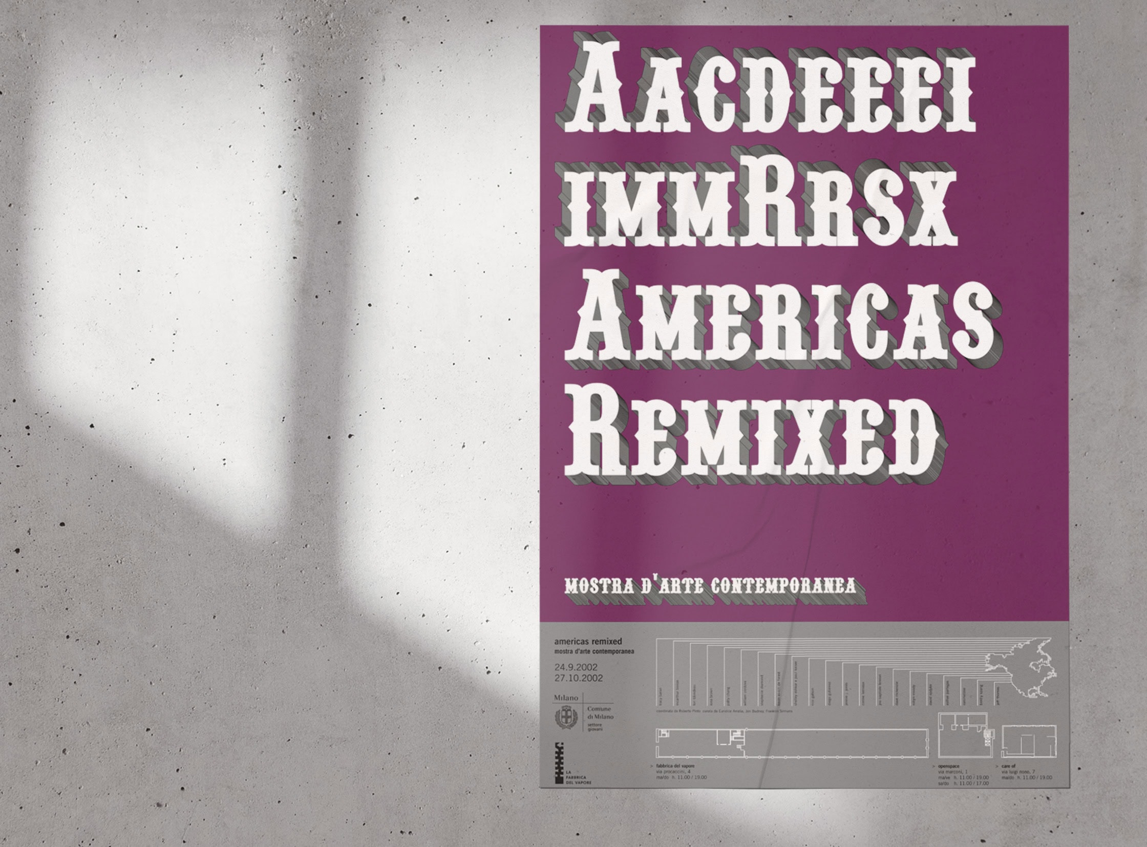
we oriented our research on a typographic elaboration of the art show title, working on legibility and dynamics of visual perception linked to it.
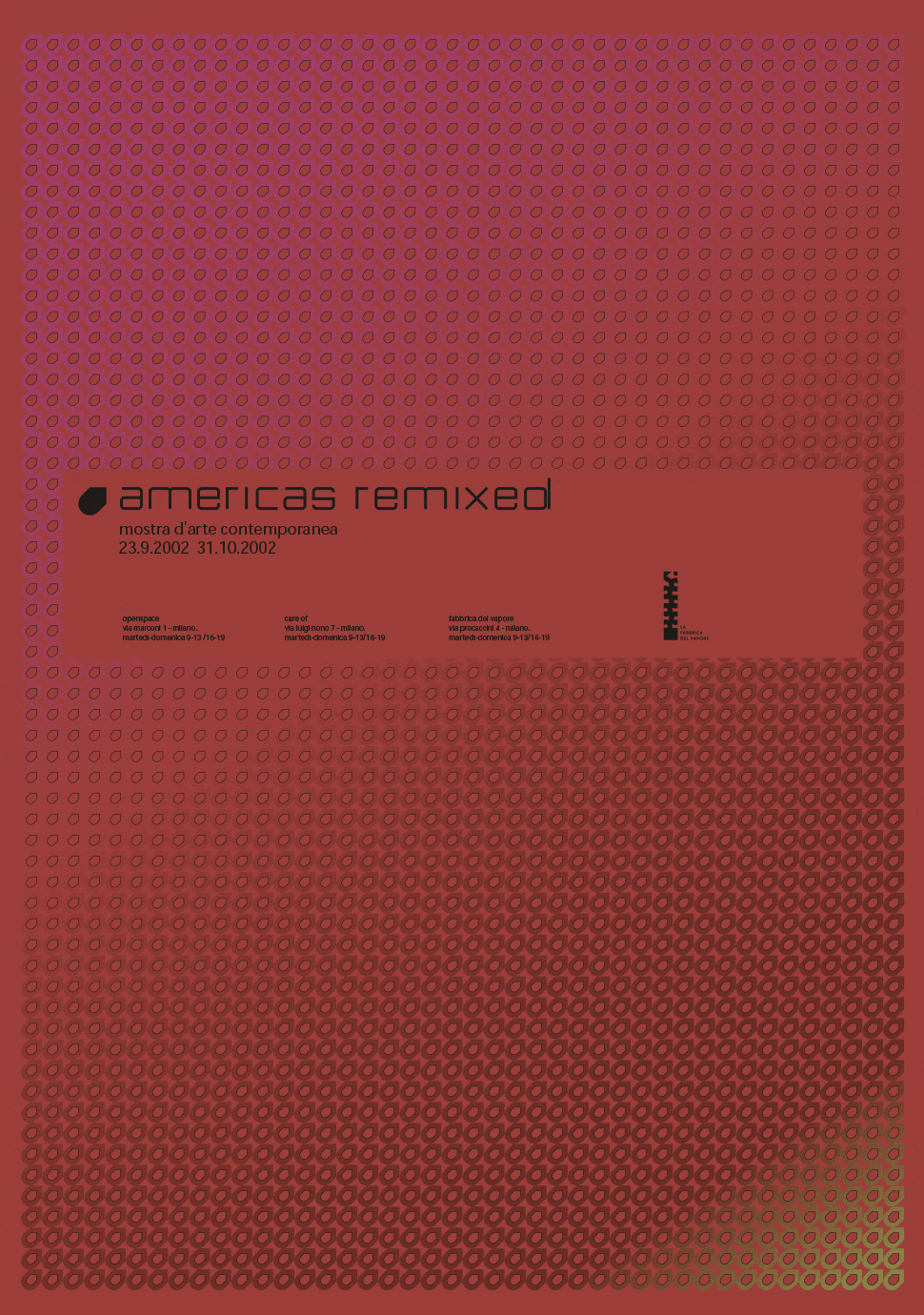
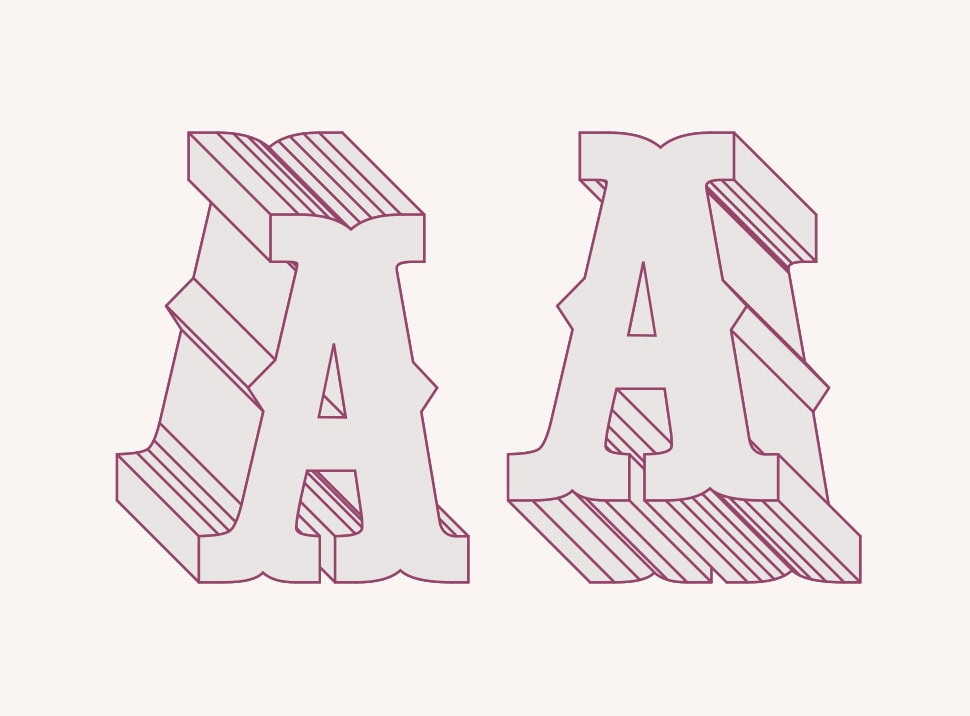
following a light and ironic philosophy of some works of the exhibition we’ve chosen the pointedly mad font as the main typography of the identity system. a font derived from western typography designed and engraved into the wood during the nineteenth century, an immediate reference to north america and its history.
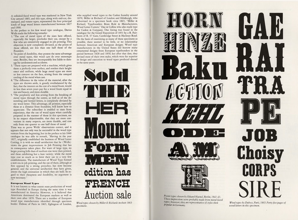
rob roy kelly, american wood type 1828-1900, van nostrand reinhold company, 1969
one of the current theme of the show is the tendency of american culture to flatten all the individuals’ cultural identities, pigeonholing and transforming them into stereotypes, making them “unreadable” and smoothening the differences.
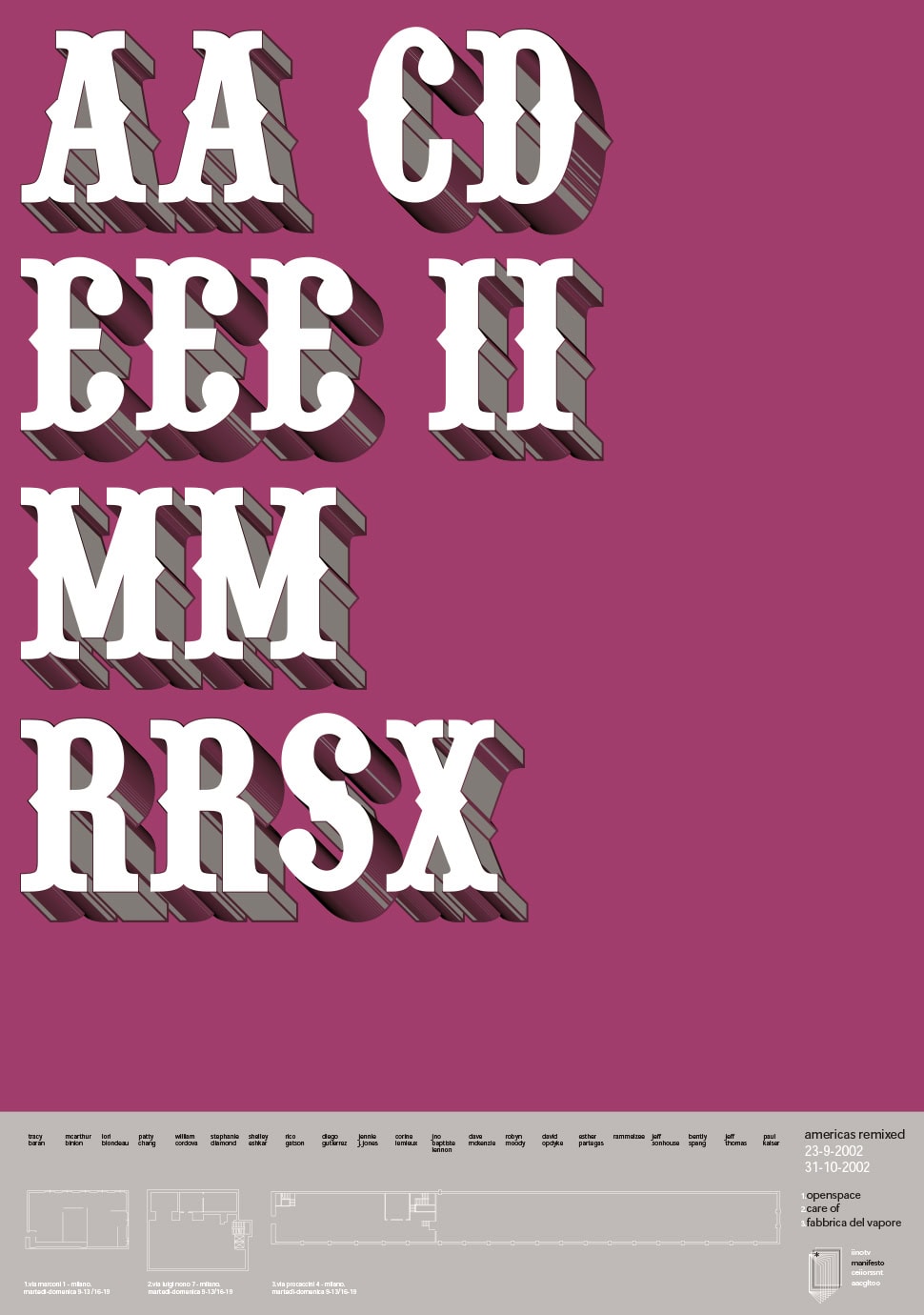
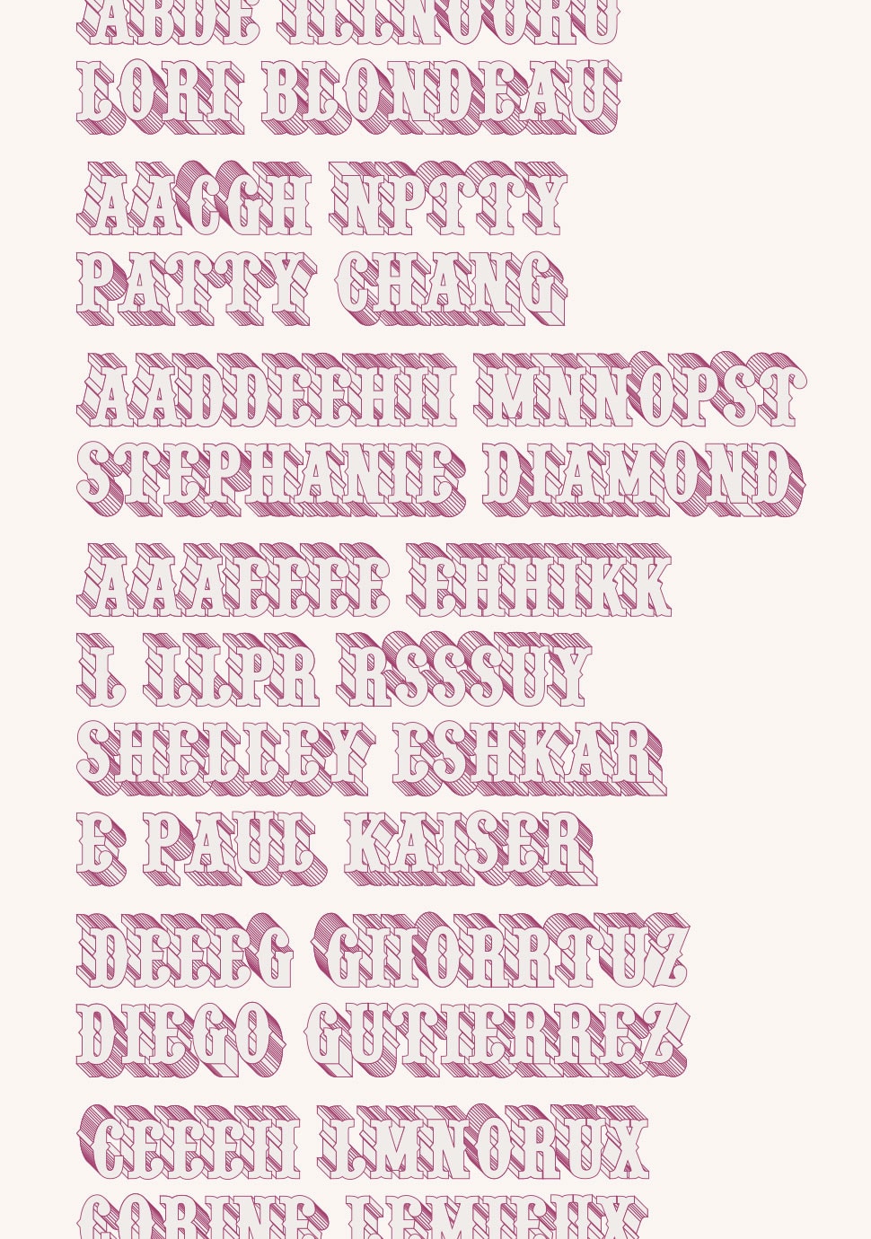
this is the vision we decided to work on so we reorganized title’s letters in the alphabetic order. so the title looses its sense and communicates to the reader an estrangement feeling close to the one the artists told us about.
we decided to extrude each letter using a wireframe style that turns the retrò look of the typo into a more experimental one becoming more art contemporary linked.
we’ve chosen a tone of magenta as the main color adding some silver details so to communicate the energy and give to the identity a pop yet sophisticated look.
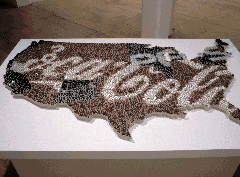
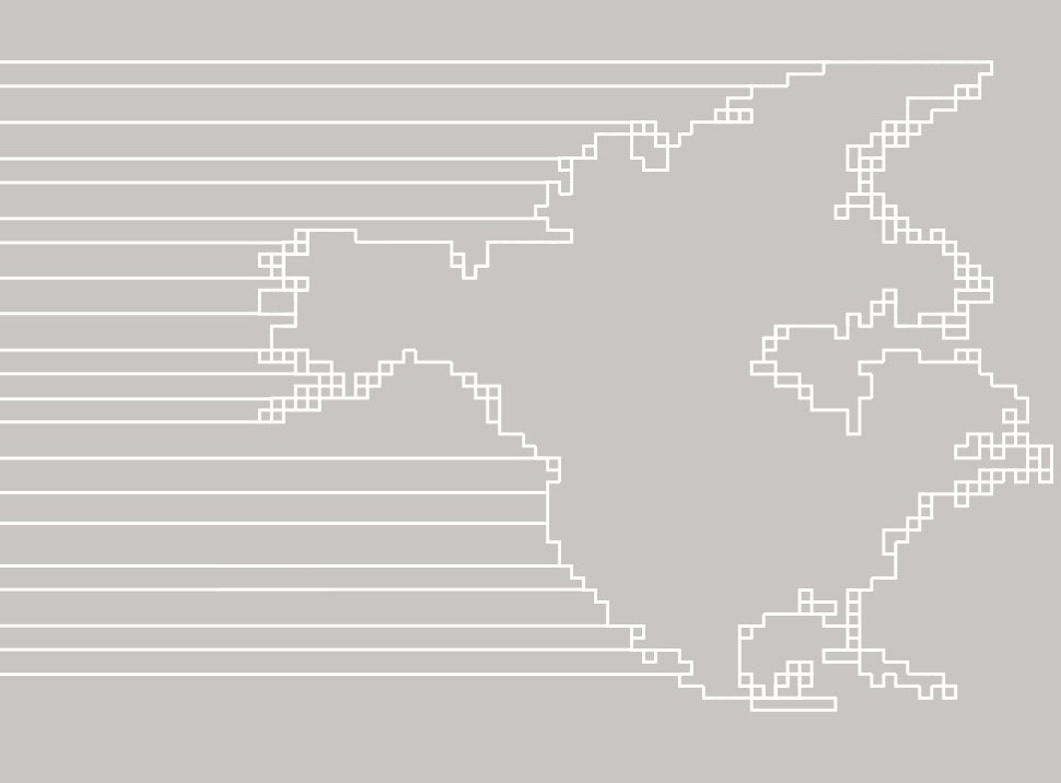
we completed the project with a stylization of the north america map and the three places of milano where the exhibition took place: la fabbrica del vapore, care of spaces and openspace.
the client refused this proposal as too experimental and asked us for new solutions.
we get back to our studio and we back to work. abandoning typography we tried to represent through shapes and colors the research of these artists. we worked on the transformation theme then the roots one but new proposals were not too incisive.
we get back to the first proposal making some changes. we add to the previous project the readable title too so to find a right balance between our idea and client’s needs. a compromise which do not weaken the project but, instead, let it become less inscrutable.
that is approved.
we applied to title’s letters an extrusion in the opposite way of the letters alphabetically ordered. that is to underline the changing point of view between the before and after, between what makes sense and what looses it, between who i was and who i am now.
we chose to use the designed font and the writing methods to present artists names into the catalogue too. the impact of the project increased, re-asserting the sense of what we wanted to communicate, making it semantically correct, and then it allowed a better coordination between visual elements, making it more syntactically coherent.
today we still look at this project with extreme satisfaction because of the conceptual approach which guided us and because of the aesthetic decisions we realized.
we are satisfied of it even for all the process. client and curators’ critiques and suggestions has really helped let us to realize a project that is actually better then what we imagined. they taught us to recall ourselves into question to search for the balance between what is beautiful and what is fair.
bruno munari, artista e designer, Laterza, 1971
services
editorial
environmental
event design
graphic design
type design
visual identity
credits
curators
roberto pinto
euridice arratia
jen budney
franklin sirmans