we could tell you about that time we gave everyone a white book. or when we wanted to bend book covers as uri geller bent spoons. or that time we re-took the measures of all our projects of the past 15 years. we could do it while drinking a glass of wine directly taken from the tail of a lowercase g.

but maybe all the stuff we’re saying are getting too surreal, let’s step back.

in 2000, 4 years later the foundation of our studio, we felt the need to cut out from the professional daily life a small space for experimentation. we decided to create a space for research where to lead visual experiments, where to find the opportunity to learn from mistakes too.

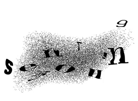
in our work we communicate messages, we make concepts visible, we deal with readability, signs and symbols, colors and images. in order to test ourselves, we decide to focus on opposite topics: what isn’t visible and what is invisible, what’s imperceptible and what is unreadable, what is indecipherable and what is censored. see nothing becomes this experimentation title.

see nothing is an investigation on everything related to the inversion of foreground and background, the deconstruction and rejection of visual clichés and the unusual use of those commonly shared codes. see nothing is seeing something that we are not used to see and hiding what is usually seen. It is watching with different eyes, from extreme point of views or even from wrong ones. see nothing is the absurdity of reversing signifier and signified.

bruno munari, design e comunicazione visiva, editori laterza, 2005

we firstly applied our research to the web.

we designed a one page website with an interactive menu on the bottom. the user could use it to move across the different subjects. this band-shaped menu replicated the same software interface used by programmers. it aimed to show everyone something that usually is not visible.

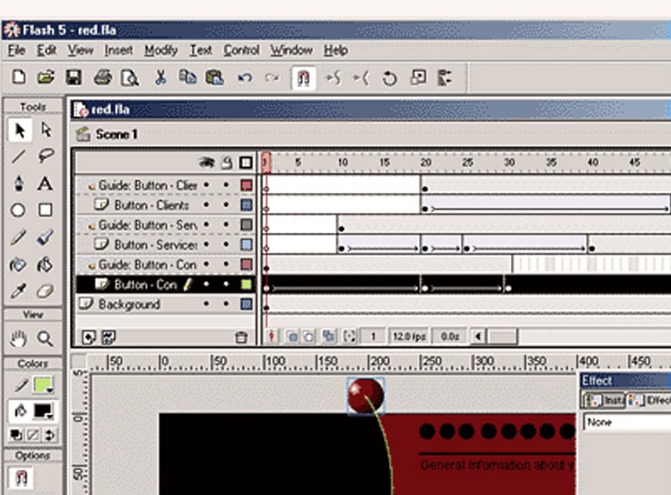
macromedia flash interface detail

the web world allowed us to wider our visual explorations, matching them with sounds and interactivity. it allowed us to stimulate different sensorial spheres, making the website navigation more engaging for the user.

users could enjoy themselves discovering birds singing or playing with moving boxes or with the moiree effect, or being trapped by the sound of an old modem, trying to see images that won’t load.

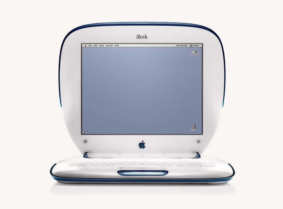
apple ibook clamshell “blueberry” – 2000

in 2003 we realized see nothing volume 1 a small book in only 200 copies

our wishes for the new year were impressed on a bookmark: to those who believe wait is more exciting than the event itself. imagination more real than reality. silence more expressive than words. everyone was free to image a different and personal use of the 64 book white pages.
the publication was wrapped and sent in white industrial materials (expanded polyethylene and polyurethane ) which created a precious and unusual packaging, as if it was gauze or silk.

__

> watch see nothing volume 1 project

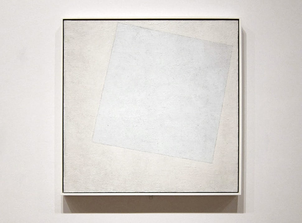
kazimir malevic, white on white, 1918

in the following years we developed another part of the see nothing project through a series of visual experiments.

we enjoyed ourselves while showing what can’t usually be seen and, at the same time, hide what is meant to be visible and comprehensible. we questioned ourselves on the typographic limits of readability, we set briefs and rules to lead these explorations, which forced us to use lateral thinking to create something interesting.

in 2006 we published see nothing volume 2, edited by aiap editions and distributed by corraini editions.

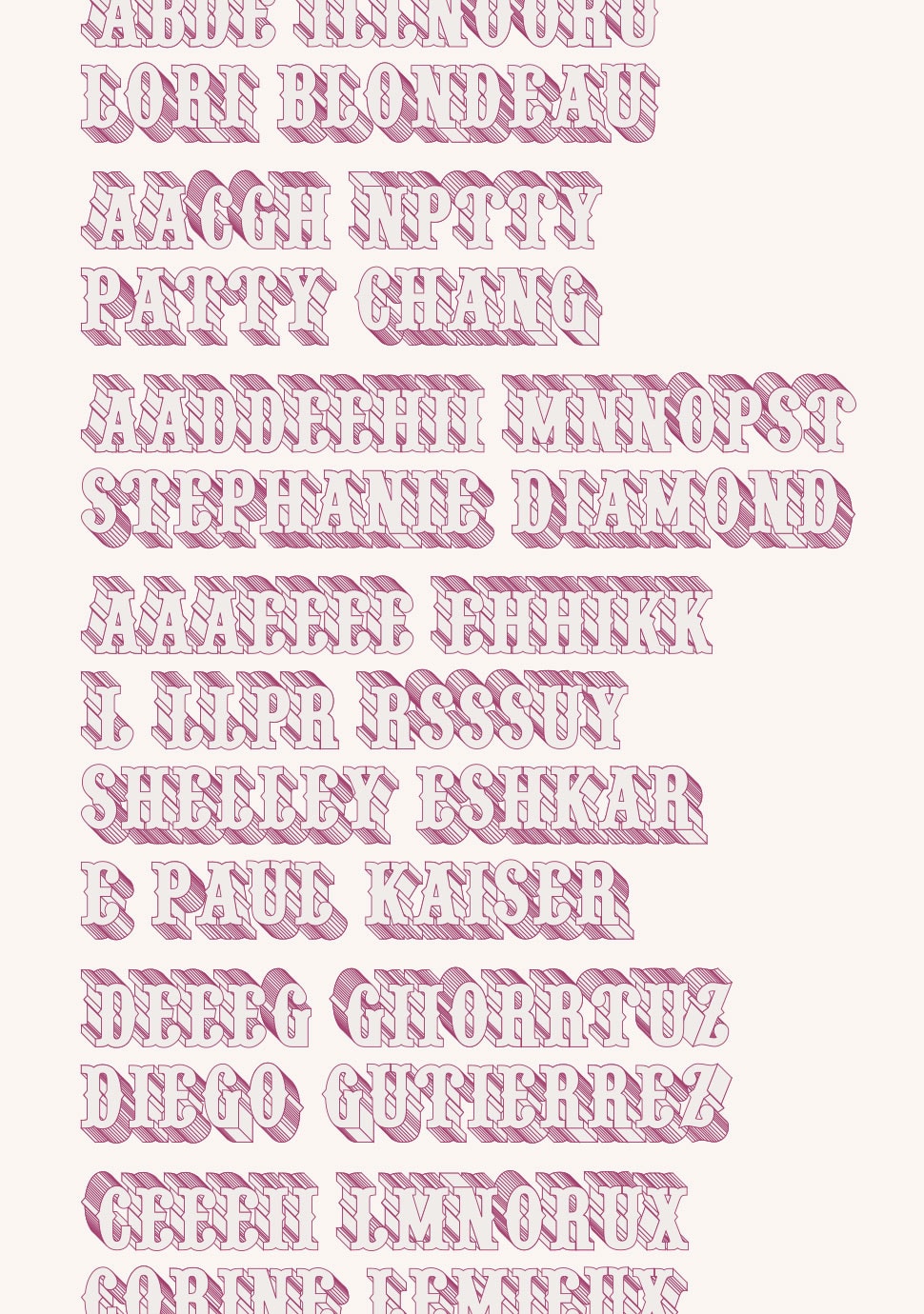
the volume has been printed in 500 numbered copies. the book collects our experimentations and contributions of graphic designers, photographers, and illustrators. some of the names are: jorge pomareda, efrem raimondi, carlos segura, leonardo sonnoli and the british studio tomato. these creatives, with their artworks interpretate the untouchable side of visual language.

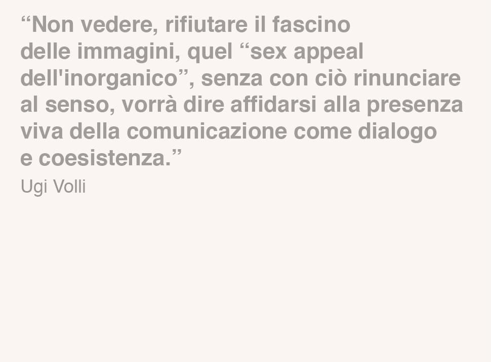
the creative contribution of every project is framed by an introductive text by the semiologist ugo volli, who places the volume in the center of a bigger reflection on the contemporary media based society.

the 96 book pages are populated by illusory figures composed by transparent rorschach spots, arabic letters hidden in arabesques, braille messages written without any relief.

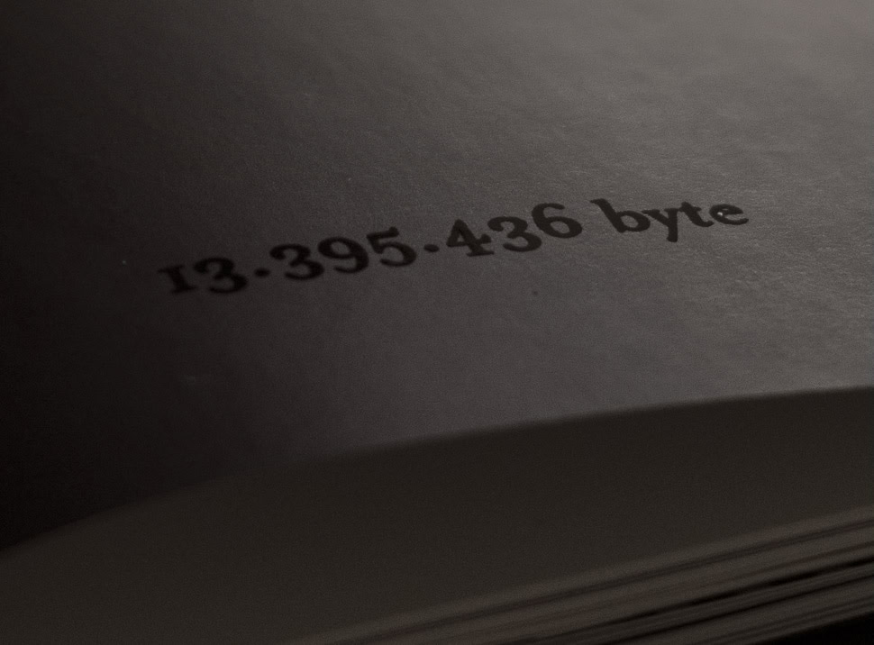
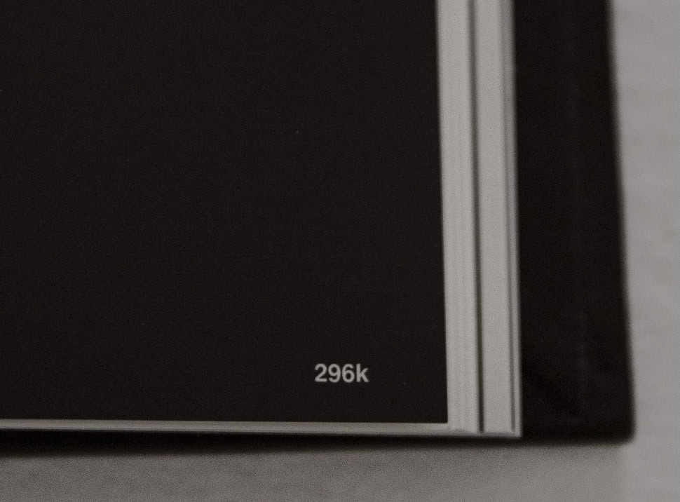
the pages sequence shows something which is usually invisible. the artworks follow one another according to their kilobyte weight. on the book eyelet you can read the total amount of bytes, the exact virtual weight of the book..

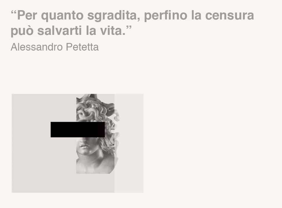
moreover, to every book page is linked a “caption” written by alessandro petetta. all the captions are collected in the end of the volume, where these small texts play with the artworks, creating an endless ironic dialogue between text and image.

regarding the book cover we forced ourselves not to use any image, text, color or graphic element. In the end, maybe inspired by munari’s talking forks, we started playing with materials and shapes to create something unique. the outcome is a black cover: simple, anonymous and ordinary in its appearance. a thin lead soul gives it the peculiarity of transforming its shape by handling and playing with it.

see nothing volume 2 wins many awards and publications, one of them is the prestigious the icograda excellence award at the 23rd international graphic design biennale of brno.

__

> watch see nothing volume 2 project


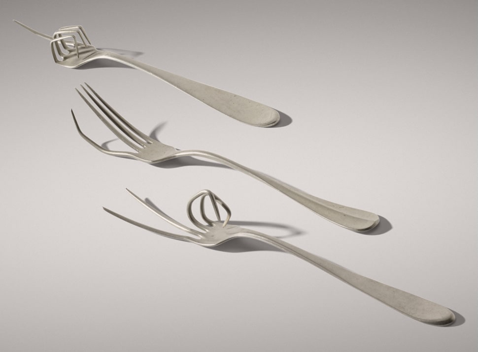
bruno munari, nobilità (dalla serie forchette parlanti), danese, 1958

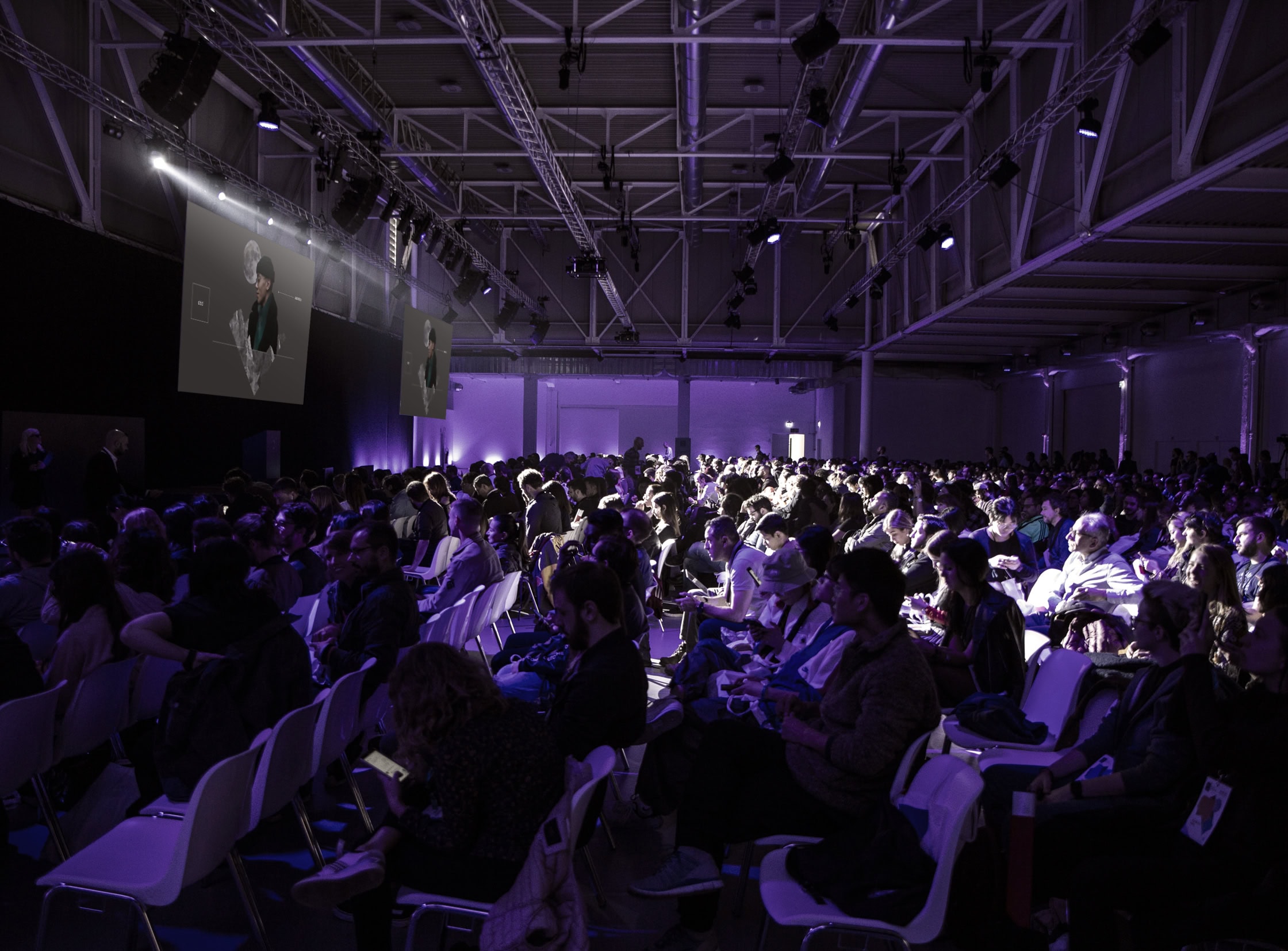
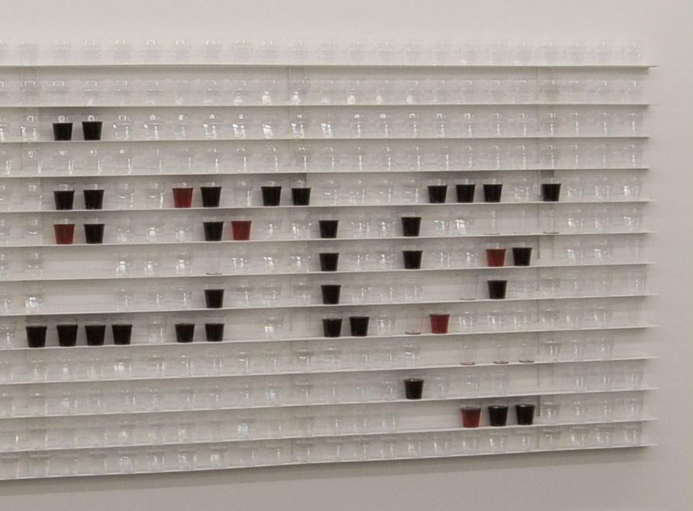
the presentation of see nothing volume 2 took place in the ArtBook library and, for the occasion, we realized an installation with 1000 glasses of water and wine in order to recreate the book title.

during the event the guests were invited to toast with us by taking glasses from the wall and deconstructing the writing, which was vanishing hour by hour.

__

> watch see nothing exhibithion

in 2008 the exploration of the see nothing theme led us to a reflection linked to the concept of time and how to misure it. the outcome is a felt object, thought to make the users know in which part of the year they are.

the elements used to create the object are: 365 (+1) dots, one for each day of the year, and 7 dots to count the days of the week.
we produced just 200 calendars, each of them came with two pins made by epoxy resin, all different from one another, as the days of our lives.

__

> watch see nothing calendar project

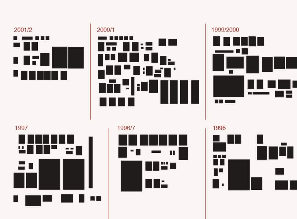
in 2012 we celebrated the 15th anniversary of our studio. it was the right moment to come out from our comfort zone and interact with an hybrid space of a milan concept store.

black box 1:5 is an installation based on black rectangles, each of it is the 1:5 scale representation of the size of our projects. we took the real sizes of each file in our archive, opening one by one: business cards, books, websites, posters. it has been an obsessive work, considering the faithfulness and precision that distinguished the project.
the black rectangles are our “black boxes”, our memory. our emotions are printed on those sizes and they belong to every projects, even if they can’t be seen.

__

> guarda il progetto di black box 1:5

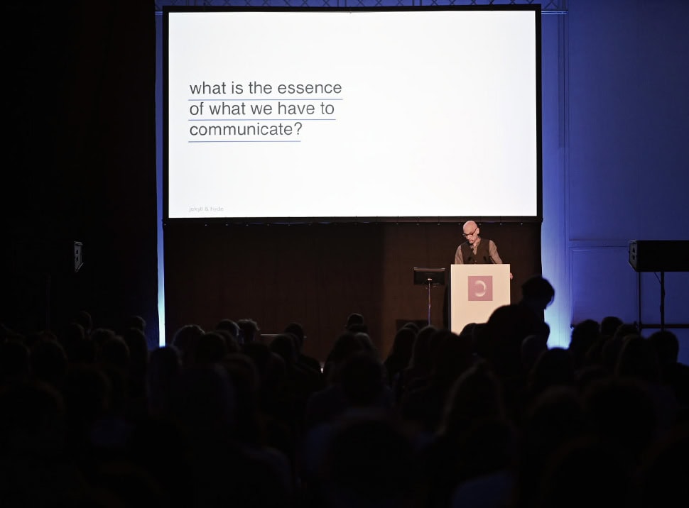
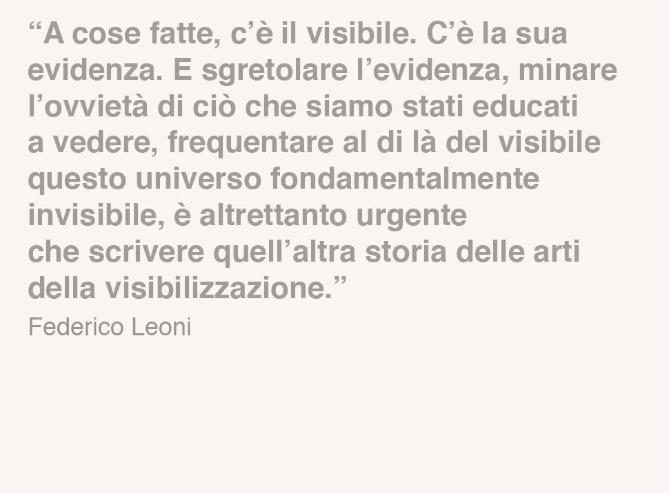
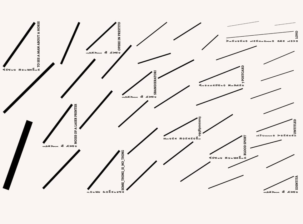
it’s 2014 and we wonder how to make the project evolve, through the always new interactive opportunities and a different narrative. we, then, design see nothing volume 3 a digital magazine, published on the apple store. one response to explore all these opportunities wouldn’t be enough, so we invite a big, heterogeneous group of communication experts to work with us, with their different, divergent, even opposite points of view.

the mag opens with federico leoni’s introduction, anthropological philosophy and professor at verona university.

the experimentations that can be seen along the 40 pages of the magazine, use the media interactivity to involve the reader as much as possible.

for instance, the reader can design a face by putting together different parts of some kids drawings, looking for the child they have been.
 or he can explore a series of pictures of the twin towers and the postcards from where they have been cut off. the result is a new utopian skyline.
the user can, also, play with parts of european flags, trying to recreate their own country’s one, while wondering if a united europe still really exists.
he can take the metro to travel from paris to chicago, to istanbul, to london or till new york, without going out to the surface.

furthermore, by rotating the device screen, it’s possible to read a small comment for each project, written by alessandro petetta, who reinterprets them in an ironic and poetic way.

for the digital edition cover, we choose to show something that runs away both from the designer and the final observer: the mouse movements necessary to design the magazine itself. an animation shows the movements lines and the click points one on another, until, more and more, they fill the screen.

__

> watch see nothing volume 3 project

see nothing it’s a key to experiment different languages from the ones we’re used to use, a new privileged point of view for alternatives minds regarding the visual communication field.

see nothing is a gym, where we can challenge ourselves. it is a never ending project, which forces us to get involved time after time, which invites us to keep exploring our profession limits.


services

art direction
digital
editorial
environmental
identity
packaging
printed
research
type design
web design


credits

see nothing volume 3
Alizarina
Giacomo Bagnara
André Bergamin
Elena Bonanomi
Carnovsky
Pietro Cocco
Fatomale
Francesca Ferrari
Marco Fornasier
Vincenzo Lanziello aka Lovo
Silvio Lorusso
Niccolò Mazzoni
Francesco Meneghini + Francesco Mantovani
Marco Nicotra
Jorge Pomareda
Stefano Rovai
Alessandro Ripane
Giuliana Tammaro
Lucille Tenazas
Ania Wawrzkowicz + Linnea Apelqvist
Jasper White

see nothing volume 2
Marco Ambrosi
Bianca Baldacci
Salma Belhaffaf
Studio ‘t Brands Weer
Elio Carmi
Luisa L. Corna
Charlotte Fuillet
Martino Pannofino
Luciano Perondi
Jorge Pomareda
Efrem Raimondi
Carlos Segura
Leonardo Sonnoli
Giacomo Spazio
Tomato

during may 2014 we have been called by widiba to restyle their new brand which was just selected from a contest on social network. widiba, born as an online bank project by mps group, should have had its debut on the market some months later.

we redesigned a new version of the logo providing particular attention to the curves harmony and the whole softness of the sign which is restyled keeping the same stroke.

during our first meetings we analyzed on a wider view the existent visual identity and we get to the conclusion that a new institutional typeface, designed ad hoc, could have been a great support for them.
we think that a person’s voice is strictly linked to his identity and that typography contribute to define brand’s identity as well.

we start the research on the widiba font development looking for inspiration from the geometries of the typography designed by herbert bayer during bauhaus and from the shapes of different devices screens with which this online bank should have reached its audience.

walter gropius, staatliches bauhaus in weimar 1919-1923, bauhaus, 1923
ellen lupton, j. abbott miller, abc’s of the bauhaus, princeton architectural press, 1991

in some letters we designed some details taken from the shape of monitor’s angle which present external curves in contraposition with squared internal ones.

the first typography designed, together with type designer fabrizio schiavi, is a round, soft and friendly font, enriched by some small details with the same strong innovative spirit of the company.

later, to let the system be more flexible, we add to the font family four different strokes of the rounded font, then a condensed version with three strokes and, at the end, one stroke of a serif version.

for all the designed typography we’ve spent a particular attention to the hinting which allowed great legibility on monitors, even on the smallest sizes.

__

> watch the wholeinstitutional font project

the result of true type programming by fabrizio schiavi

widiba wanted to re-think of its brand position, it is an evolution in terms of service and target too. in 2015 they decided to let us be the consultant to develop the new graphic format project.

the system we design has to be able to represent the identity of the company and to give support in a coordinated way, along all the communication materials, so to increase the brand awareness.

we always think of a brand identity as a human being, with his own values and his way of communicating which is distinctive for each of us.
through an anthropomorphic representation of the brand we help the client become aware of the changing from who they was to whom they’ll become.

it is an analysis process which help us to let widiba essence and its personality emerge, to define the style it will have and its tone of voice.

that is something allowing the bank to built up an authentic bond with its audience and us to design a more distinctive graphic format.

we design a complex system with different elements: brand, institutional typography, icon set, art direction photography, color palette and modular grid.

three graphic modules communicate between each other moving into the space and creating ever new compositions always recognizable so to adapt easily to different formats and medias. it is a simulation of a responsive system linked to the ideal of this bank as an online and customizable platform.

everything is coded into a large brand guideline.

__

> go to the graphic format presentation project

in 2016 widiba was designing their new bank headquarters and we’ve been nominated to develop the wayfinding system.

working at home means to work in a comfortable, informal, cozy, relaxed way. that is exactly the spirit of the bank introduced in its new spaces through all the architectonical project by zanon architetti associati.

our work starts from a question that is: how is a home wayfinding?
in our houses there is no a proper wayfinding and it is usually developed informally, sometimes casually.
information are often written by hand and calligraphy became the way to connect who is writing the message and who will read it.

our project is based on that answer and we developed an informative wayfinding and a more decorative one.

we analyzed the offices and people fluxes to understand the complexity of the space, the main junctions and the spot needing indication in terms of quantity and typology.

we work on the project using wayfinding principles linked to the creation fo a landmark to guide, then we create structured paths and floor maps to give a wider vision of the space.

the initial concept lead us to design a serie of panels casually leaning against the wall close to the main junctions, they became the core of the wayfinding system bringing all the main information to move into the offices.

illustrations by simona bonafini

we invited 10 calligraphers, italians and internationals, to write on the wall the names of the floors and of the meeting rooms creating different landmarks into widiba space, each with its personality give by the calligrapher style.

the wayfinding system is completed by some panels with concise maps and an icon set.

dutch calligrapher daan wille of blazin team at work

he informal spirit of the bank and its no ordinary style is translated even on floor’s names and meeting room’s one. floor has been called by short phrases suggesting the main activities of the space and the more common names of widiba people has been chosen to describe the meeting rooms.

creating experiences becomes the name of marketing and digital innovation offices floor, why not! is the ceo floor, let’s meet up is the floor dedicated to meeting rooms and auditorium.

if you want to schedule a metting you can just announce: “let’s meet to marco’s” or “see you to anna’s”.

__

> watch the complete wayfinding project

this is one of the most complete and complex branding project we have worked for, it allowed us to use our method and our passion to design all the elements of the identity system: from the “micro” like typography, to the “macro” ones as wayfinding.

in 2018 we continue to support the company in the development of its brand designing the identity for the private division of the bank, widiba prime.
we have started our research from a semiotic board defining the luxury market. the perfect positioning counting the offered service has been identified within the dial named “self-gratification”, defined by the two axis of being and value.

the terms that represent in the best way the qualitative aspects of goods and experiences of its clients – always related to their personal satisfaction – are: wellness and passion. These are the main values to identify widiba prime.

at the basis of the identity system of this service there is a thin frame starting from the logotype to select and show the best for the client: a conceptual representation of the wealth management private service aiming to a qualitative life in its entirety, where the financial aspect is just one of its components.

the logotype has been created with the institutional font and it is paired to a color palette of dark greys and brilliant bronze details evoking style and elegance.
the art direction guiding the photography is very sophisticated, huge architectural spaces alternating with details of natural materials or design objects complete the mood of this project dedicated to such a high offer.

__

> go to widiba prime project

the bank has grown over time and in 2020, thanks to the ability of changing rapidly, has added a new chapter to its history.

with an increasingly transversal presence on the market and widespread in the territory, widiba felt the need to review its positioning, especially in the light of the changed needs of the reference context.
the transformation must be capable of reflecting the evolution of the bank so to be rightly perceived on the market.

our approach is always based on a wide research, in this special case has been supported by the widiba brand identity analysis by tsw – the sixth w.
we have created a new personification of the brand and, together with widiba, we have defined the personality as innovative, authoritative and smart. therefore the tone of voice has been described as brilliant, safe and simple. without loosing its modern and innovative dna widiba has been described in a new way able of better communicating its new shape.

the most relevant change has been done on the wording with the addition of “banca” which is now officially part of the logotype. the project then has been developed respecting the visual language we created together with them over the years.
the key points of the rebranding are the use of the all-caps instead of the lower case and the visual dialog between bold and medium weights of the logotype.

the trademark has been redesigned in a more thin way and the institutional colors has been made less saturated. the previous pop impact of the visual identity has become more sophisticated and authoritative consistently with the growth of the brand.

during the development of the new graphic format we have been guided by a tagcloud with three cornerstones: dynamic, organized and contemporary. on these semantic groundings we have built a visual system based on a series of rectangular shapes moving around in a responsive way so to adapt easily on different devices and tools.

we have reserved a particular interest to the art direction and the iconographic support of all the communication.

our work, comprehending the external restyle of the financial advisors offices throughout the territory, has been concluded by the realization of the brand manual and the video launching the new identity.

during these years of consultancies at widiba we had the chance to meet a lot of energy people with whom we share a innovative vision and who inspired us over time.
it feels like being real partners of this group we still give support to in the development of the brand identity.

services

art direction
branding
consultancy
editorial
environmental
graphic design
installation
naming
type design
visual identity
wayfinding

credits

type design with
fabrizio schiavi

calligraphers

luca barcellona (italy)
team blazin (holland)
barbara calzolari (italy)
francesco guerrera (italy)
mr kams (spain)
deep masito (italy)
piger (italy)
andrea rafiki (italy)
mr zé (spain)
alessandro zonta (italy)

digital design days is the international event dedicated to digital design, it has been created by filippo spiezia in 2016.

The project is due to reinforce the founders’ willingness to be an international reference, confirming their ability to select, narrate, and reward the most visionary and most creative digital designers.

we’ve been involved in 2019 to design the new brand signature and we developed it with a wider viewing, underlining how this event is already felt like a real brand by being always able to guarantee the highest quality in what it proposes.

Since its first edition the festival has been able to create a network between all the participants, and this network succeeded in growing beyond the event itself. Professionals, entrepreneurs, and companies started to collaborate in order to make what they had in mind for the future come true, after participating to the event and sharing their ideas.

We have analyzed and defined the deepest side of DDD in order to create a really distinctive visual identity.

a brand has to be able to live and evolve. it has to work on different situations. it has to have the possibility to adapt, as a real human being, but still always remaining faithful to itself. that’s the way how to create a bond between the brand and its audience, a relationship based on trust and values sharing.

so, following our method, the first question to which find an answers has been: who is digital design days?

our working process is totally shared with the client through interviews, tests and moodboards we work to let emerge brand values and its personality defining the style and the tone of voice it will carry on.

we try to help the client, working between archetypes and neuroscience, to gain awareness of who is or of who want to become.

we started to design the outside, the shape, the appearance, only after developing the insides of the brand.

the new brand is the synthesis of a long visual and conceptual research.

it has been decided to design a new sign but still able to evoke the one of the previous editions thanks to the adding of a squared shape.

all the formal explorations we developed, looking for the necessary distinctiveness of the event, have been guided by the natural synthesis of digital design days spirit, values and activities.

the D that has been chosen is light, energy, movement, different single elements that come together to define it, pixels overcoming their two-dimensional feature, squares that rotate and find a new place around the central focusing point.

it is a sign able to communicate the strength of DDD innovative vision and its capacity to create network and to attract, propose and unite people and different ideas.

we designed a responsive sign, able to adapt to the dimension of usage by just changing the frequency of the single elements of which it is made, resulting in obtaining a more efficient utilization in every different application.

a contemporary and innovative vision of the brand signature imagined as a alive and vital element.

the main palette of the visual identity system is made of nine colors, contributing to define different editions in different countries.

the selected colors are rgb native tones, luminous and with high contrast. In the identity system each color fades into another thanks to easy geometrical shapes morphing creating a dynamic yet sophisticated impact, well suited for the communication of this event.

the analysis of this project has been particularly curated and we’ve reached a definition, together with filippo spiezia and his team, of the deepest characteristics of this event. starting from what the event was and imaging what should it become, the final sign is able to represent and let it be internationally recognizable.

the special conclusion of this work occurred during the last festival edition, on october 2019, when, during the new brand launch, we had the occasion to share with the public our entire process of the rebranding project.

__

> guarda il progetto completo del rebranding

services

art direction
branding
consultancy
concept development
graphic design
strategy
visual identity


credits

logo animation
nerdo

logo sound
combustion studio

in 2002 we’ve been called by the city of milano to design the visual identity for the exhibition americas remixed.

the art show is an idea of roberto pinto together with euridice arratia, jen budney and franklin sirmans and ti is composed by 22 artworks by young north-american artists.

the artists of the exhibition are from different cultural origins, from ethnics and religious majorities and minorities. they use their photographs to reflect on the condition of north-america society trying to find an artistic and cultural identity. they are young people questioning on the redefinition of the relationship between themselves and others.

the works selected by curators create a complex portrait, emotional and passional, even ironic, provocative and desecrating.

how can we represent this kind of lost, this look for sense? how can we condense all these different works into a unique visual identity? these are the questions we asked ourselves to define a space for creativity with precise limits too.

we decided not to choose one of the works as the representative of the whole exhibition to the detriment of the others artists.

we oriented our research on a typographic elaboration of the art show title, working on legibility and dynamics of visual perception linked to it.

following a light and ironic philosophy of some works of the exhibition we’ve chosen the pointedly mad font as the main typography of the identity system. a font derived from western typography designed and engraved into the wood during the nineteenth century, an immediate reference to north america and its history.

rob roy kelly, american wood type 1828-1900, van nostrand reinhold company, 1969

one of the current theme of the show is the tendency of american culture to flatten all the individuals’ cultural identities, pigeonholing and transforming them into stereotypes, making them “unreadable” and smoothening the differences.

this is the vision we decided to work on so we reorganized title’s letters in the alphabetic order. so the title looses its sense and communicates to the reader an estrangement feeling close to the one the artists told us about.

we decided to extrude each letter using a wireframe style that turns the retrò look of the typo into a more experimental one becoming more art contemporary linked.

we’ve chosen a tone of magenta as the main color adding some silver details so to communicate the energy and give to the identity a pop yet sophisticated look.

we completed the project with a stylization of the north america map and the three places of milano where the exhibition took place: la fabbrica del vapore, care of spaces and openspace.

the client refused this proposal as too experimental and asked us for new solutions.

we get back to our studio and we back to work. abandoning typography we tried to represent through shapes and colors the research of these artists. we worked on the transformation theme then the roots one but new proposals were not too incisive.

we get back to the first proposal making some changes. we add to the previous project the readable title too so to find a right balance between our idea and client’s needs. a compromise which do not weaken the project but, instead, let it become less inscrutable.

that is approved.

we applied to title’s letters an extrusion in the opposite way of the letters alphabetically ordered. that is to underline the changing point of view between the before and after, between what makes sense and what looses it, between who i was and who i am now.

we chose to use the designed font and the writing methods to present artists names into the catalogue too. the impact of the project increased, re-asserting the sense of what we wanted to communicate, making it semantically correct, and then it allowed a better coordination between visual elements, making it more syntactically coherent.

today we still look at this project with extreme satisfaction because of the conceptual approach which guided us and because of the aesthetic decisions we realized.

we are satisfied of it even for all the process. client and curators’ critiques and suggestions has really helped let us to realize a project that is actually better then what we imagined. they taught us to recall ourselves into question to search for the balance between what is beautiful and what is fair.

__
> see the whole project here

bruno munari, artista e designer, Laterza, 1971

services

editorial
environmental
event design
graphic design
type design
visual identity


credits

curators
roberto pinto
euridice arratia
jen budney
franklin sirmans