during may 2014 we have been called by widiba to restyle their new brand which was just selected from a contest on social network. widiba, born as an online bank project by mps group, should have had its debut on the market some months later.
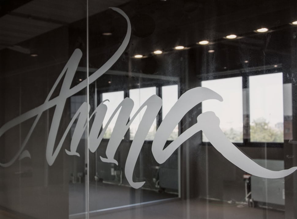
we redesigned a new version of the logo providing particular attention to the curves harmony and the whole softness of the sign which is restyled keeping the same stroke.
during our first meetings we analyzed on a wider view the existent visual identity and we get to the conclusion that a new institutional typeface, designed ad hoc, could have been a great support for them.
we think that a person’s voice is strictly linked to his identity and that typography contribute to define brand’s identity as well.
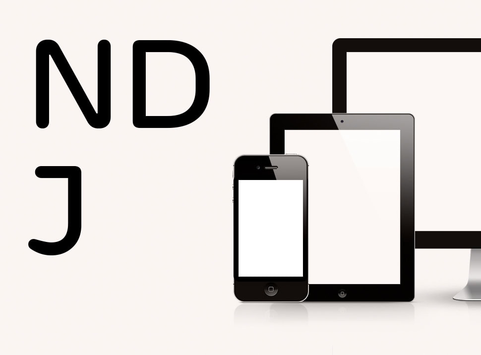
we start the research on the widiba font development looking for inspiration from the geometries of the typography designed by herbert bayer during bauhaus and from the shapes of different devices screens with which this online bank should have reached its audience.
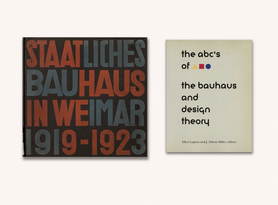
walter gropius, staatliches bauhaus in weimar 1919-1923, bauhaus, 1923
ellen lupton, j. abbott miller, abc’s of the bauhaus, princeton architectural press, 1991
in some letters we designed some details taken from the shape of monitor’s angle which present external curves in contraposition with squared internal ones.
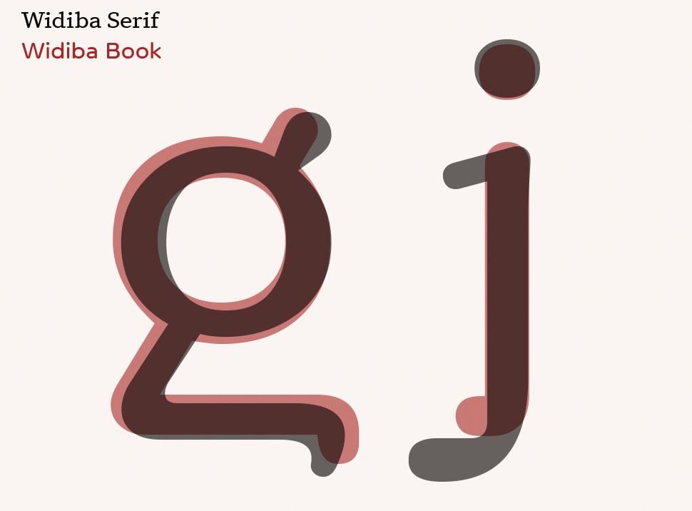
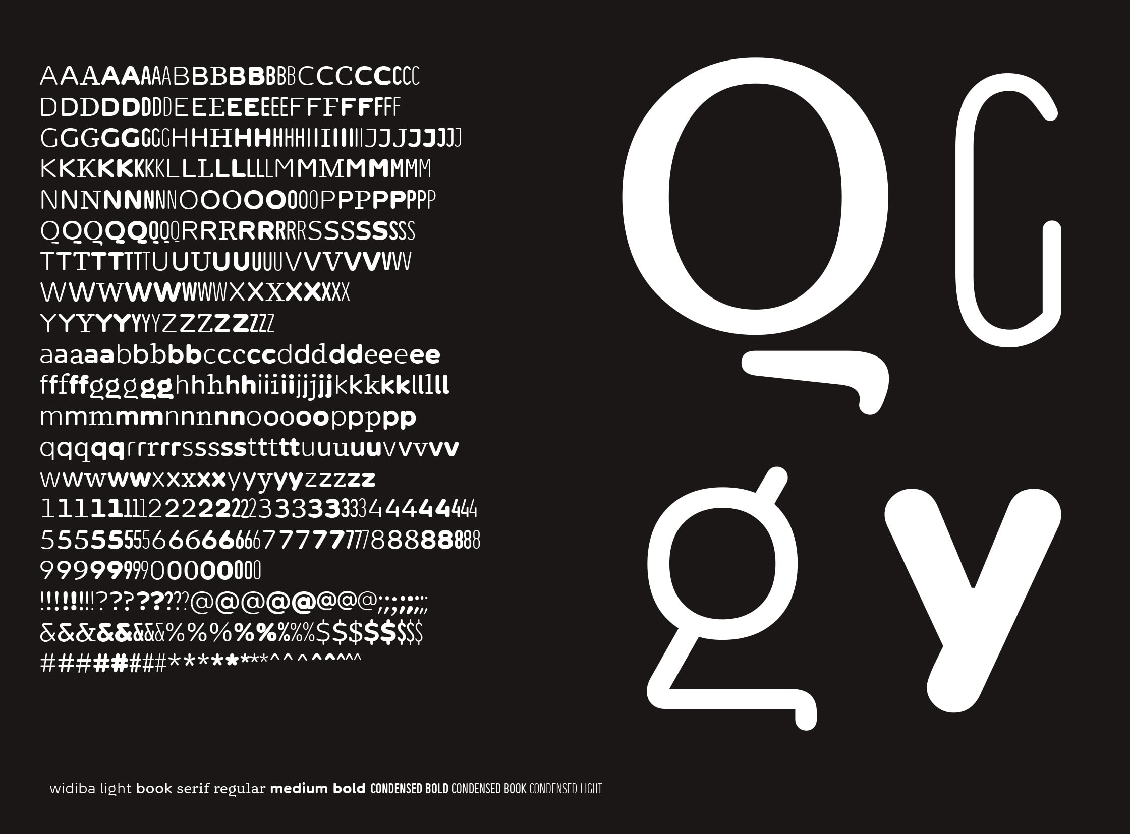
the first typography designed, together with type designer fabrizio schiavi, is a round, soft and friendly font, enriched by some small details with the same strong innovative spirit of the company.
later, to let the system be more flexible, we add to the font family four different strokes of the rounded font, then a condensed version with three strokes and, at the end, one stroke of a serif version.
for all the designed typography we’ve spent a particular attention to the hinting which allowed great legibility on monitors, even on the smallest sizes.
__
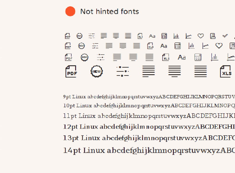
the result of true type programming by fabrizio schiavi
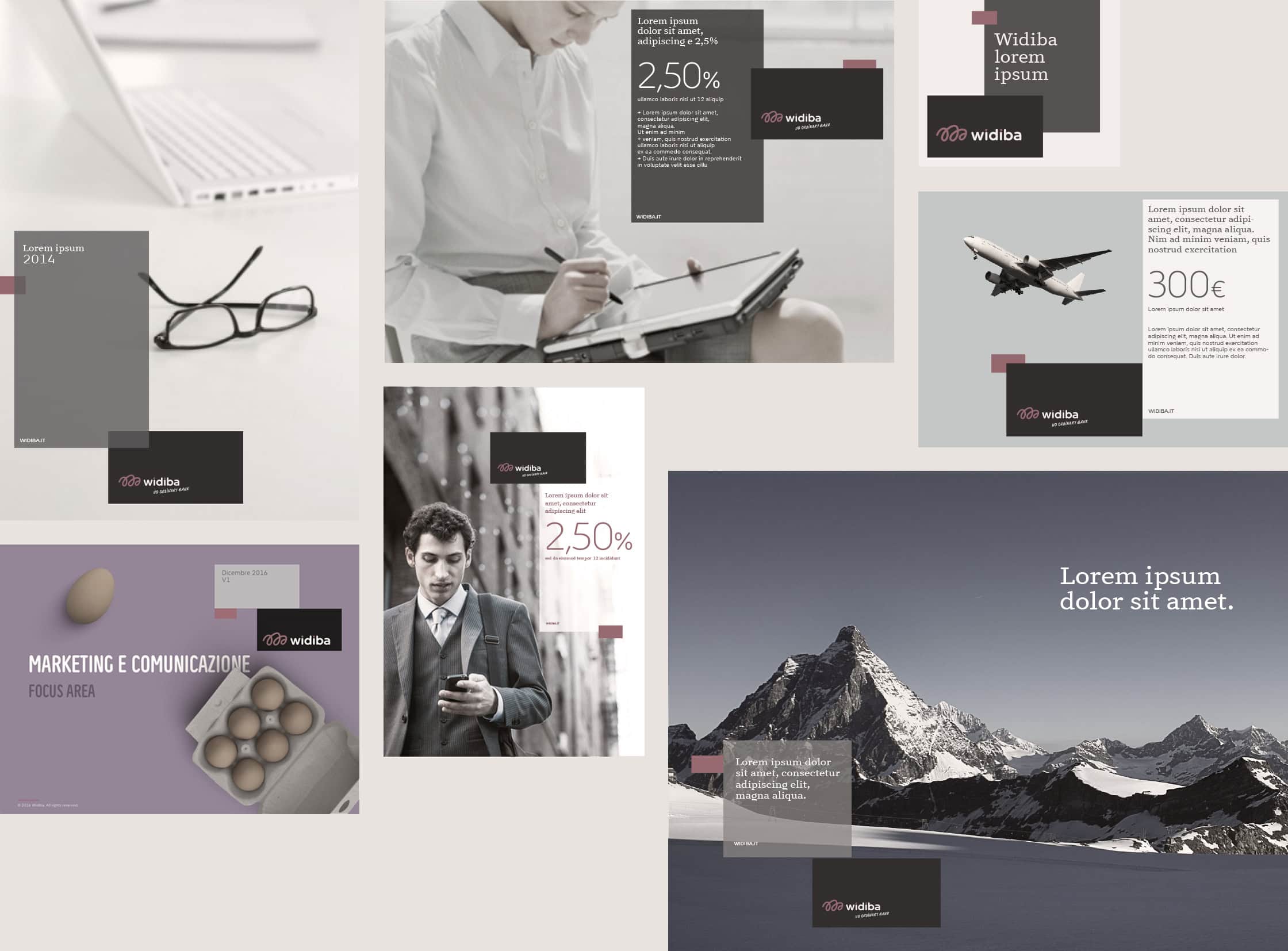
widiba wanted to re-think of its brand position, it is an evolution in terms of service and target too. in 2015 they decided to let us be the consultant to develop the new graphic format project.
the system we design has to be able to represent the identity of the company and to give support in a coordinated way, along all the communication materials, so to increase the brand awareness.
we always think of a brand identity as a human being, with his own values and his way of communicating which is distinctive for each of us.
through an anthropomorphic representation of the brand we help the client become aware of the changing from who they was to whom they’ll become.
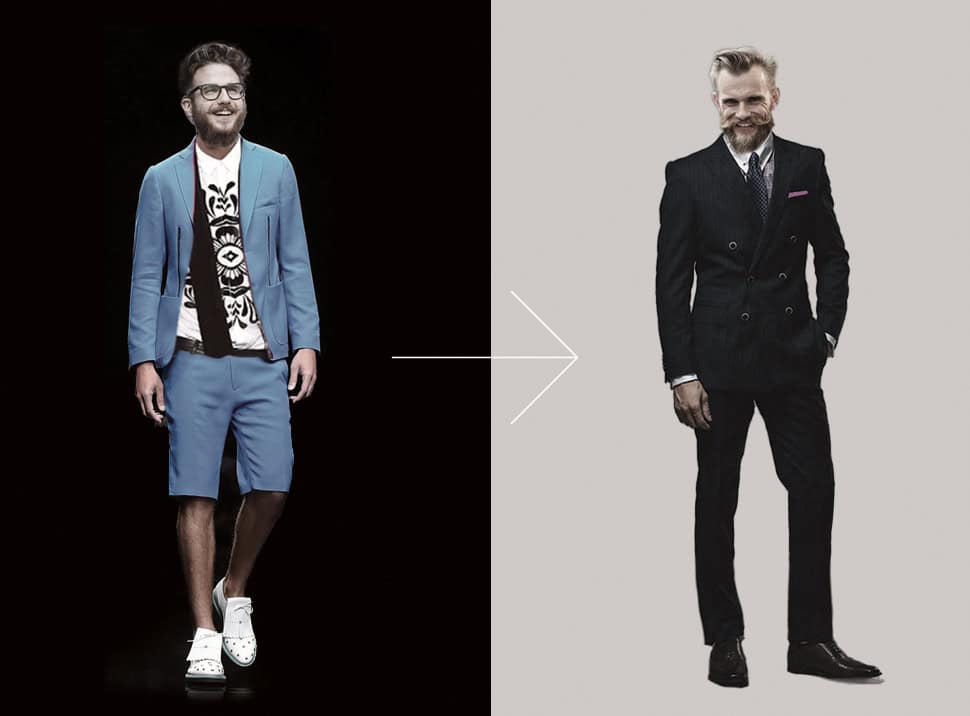
it is an analysis process which help us to let widiba essence and its personality emerge, to define the style it will have and its tone of voice.
that is something allowing the bank to built up an authentic bond with its audience and us to design a more distinctive graphic format.
we design a complex system with different elements: brand, institutional typography, icon set, art direction photography, color palette and modular grid.
three graphic modules communicate between each other moving into the space and creating ever new compositions always recognizable so to adapt easily to different formats and medias. it is a simulation of a responsive system linked to the ideal of this bank as an online and customizable platform.
everything is coded into a large brand guideline.
__
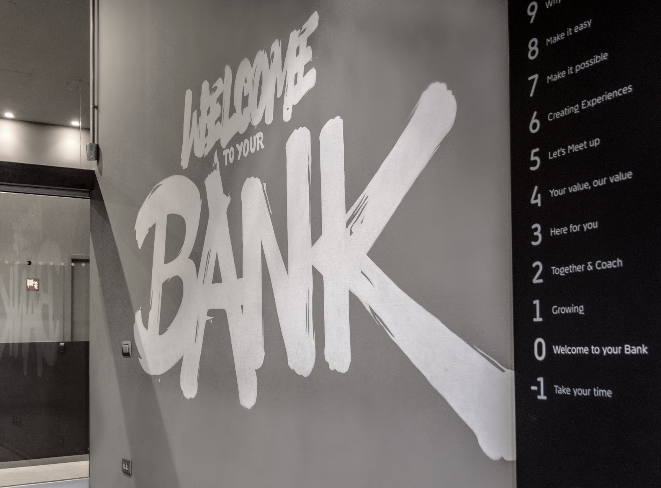
in 2016 widiba was designing their new bank headquarters and we’ve been nominated to develop the wayfinding system.
working at home means to work in a comfortable, informal, cozy, relaxed way. that is exactly the spirit of the bank introduced in its new spaces through all the architectonical project by zanon architetti associati.
our work starts from a question that is: how is a home wayfinding?
in our houses there is no a proper wayfinding and it is usually developed informally, sometimes casually.
information are often written by hand and calligraphy became the way to connect who is writing the message and who will read it.
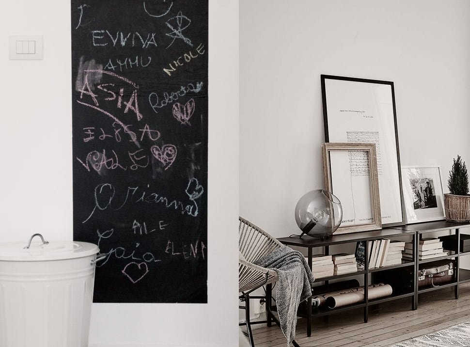
our project is based on that answer and we developed an informative wayfinding and a more decorative one.
we analyzed the offices and people fluxes to understand the complexity of the space, the main junctions and the spot needing indication in terms of quantity and typology.
we work on the project using wayfinding principles linked to the creation fo a landmark to guide, then we create structured paths and floor maps to give a wider vision of the space.
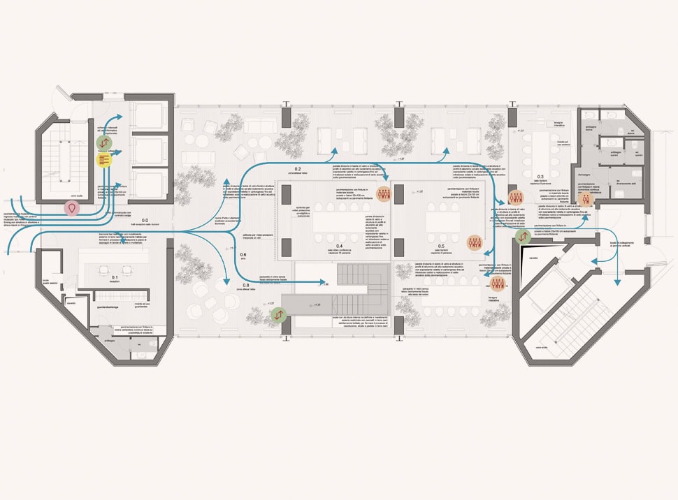
the initial concept lead us to design a serie of panels casually leaning against the wall close to the main junctions, they became the core of the wayfinding system bringing all the main information to move into the offices.
illustrations by simona bonafini
we invited 10 calligraphers, italians and internationals, to write on the wall the names of the floors and of the meeting rooms creating different landmarks into widiba space, each with its personality give by the calligrapher style.
the wayfinding system is completed by some panels with concise maps and an icon set.
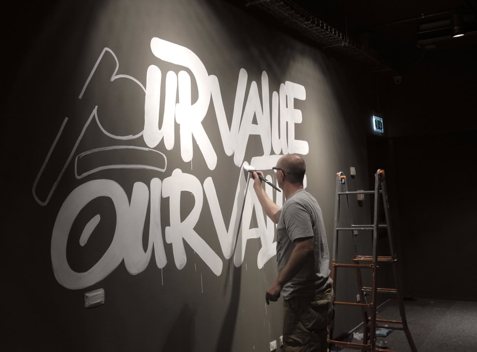
dutch calligrapher daan wille of blazin team at work
he informal spirit of the bank and its no ordinary style is translated even on floor’s names and meeting room’s one. floor has been called by short phrases suggesting the main activities of the space and the more common names of widiba people has been chosen to describe the meeting rooms.
creating experiences becomes the name of marketing and digital innovation offices floor, why not! is the ceo floor, let’s meet up is the floor dedicated to meeting rooms and auditorium.
if you want to schedule a metting you can just announce: “let’s meet to marco’s” or “see you to anna’s”.
__
this is one of the most complete and complex branding project we have worked for, it allowed us to use our method and our passion to design all the elements of the identity system: from the “micro” like typography, to the “macro” ones as wayfinding.
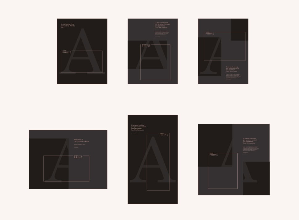
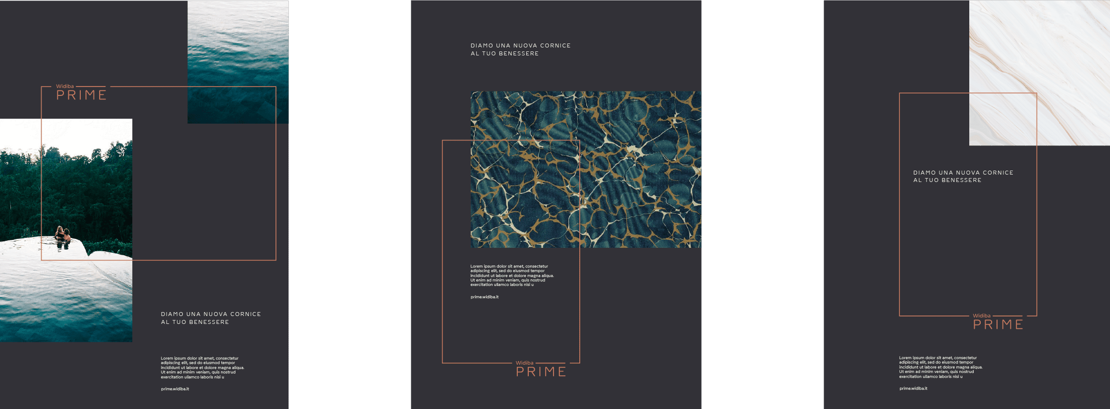
in 2018 we continue to support the company in the development of its brand designing the identity for the private division of the bank, widiba prime.
we have started our research from a semiotic board defining the luxury market. the perfect positioning counting the offered service has been identified within the dial named “self-gratification”, defined by the two axis of being and value.
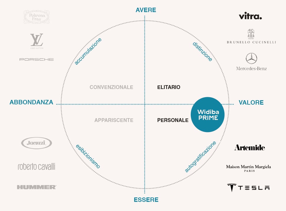
the terms that represent in the best way the qualitative aspects of goods and experiences of its clients – always related to their personal satisfaction – are: wellness and passion. These are the main values to identify widiba prime.
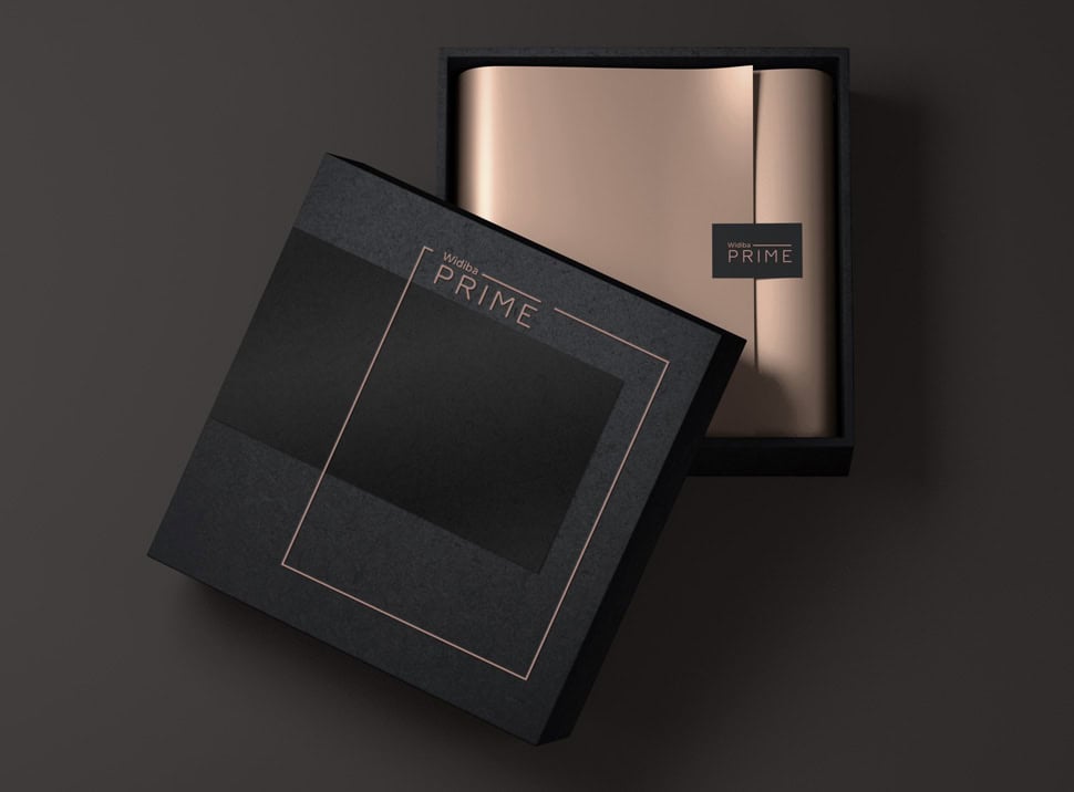
at the basis of the identity system of this service there is a thin frame starting from the logotype to select and show the best for the client: a conceptual representation of the wealth management private service aiming to a qualitative life in its entirety, where the financial aspect is just one of its components.
the logotype has been created with the institutional font and it is paired to a color palette of dark greys and brilliant bronze details evoking style and elegance.
the art direction guiding the photography is very sophisticated, huge architectural spaces alternating with details of natural materials or design objects complete the mood of this project dedicated to such a high offer.
__
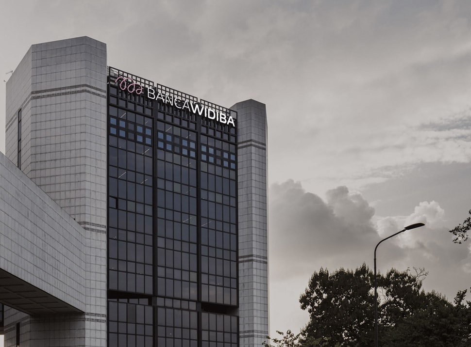
the bank has grown over time and in 2020, thanks to the ability of changing rapidly, has added a new chapter to its history.
with an increasingly transversal presence on the market and widespread in the territory, widiba felt the need to review its positioning, especially in the light of the changed needs of the reference context.
the transformation must be capable of reflecting the evolution of the bank so to be rightly perceived on the market.

our approach is always based on a wide research, in this special case has been supported by the widiba brand identity analysis by tsw – the sixth w.
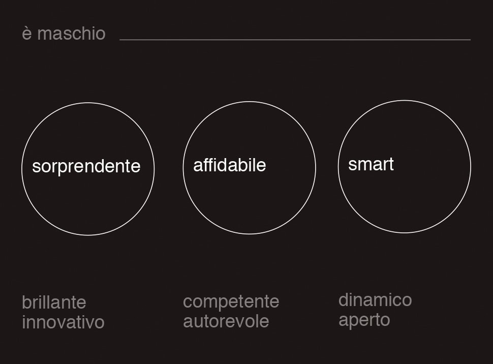
we have created a new personification of the brand and, together with widiba, we have defined the personality as innovative, authoritative and smart. therefore the tone of voice has been described as brilliant, safe and simple. without loosing its modern and innovative dna widiba has been described in a new way able of better communicating its new shape.
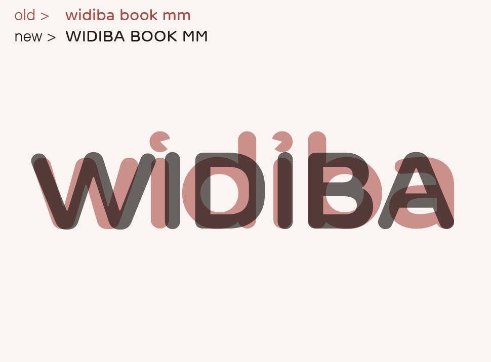
the most relevant change has been done on the wording with the addition of “banca” which is now officially part of the logotype. the project then has been developed respecting the visual language we created together with them over the years.
the key points of the rebranding are the use of the all-caps instead of the lower case and the visual dialog between bold and medium weights of the logotype.
the trademark has been redesigned in a more thin way and the institutional colors has been made less saturated. the previous pop impact of the visual identity has become more sophisticated and authoritative consistently with the growth of the brand.
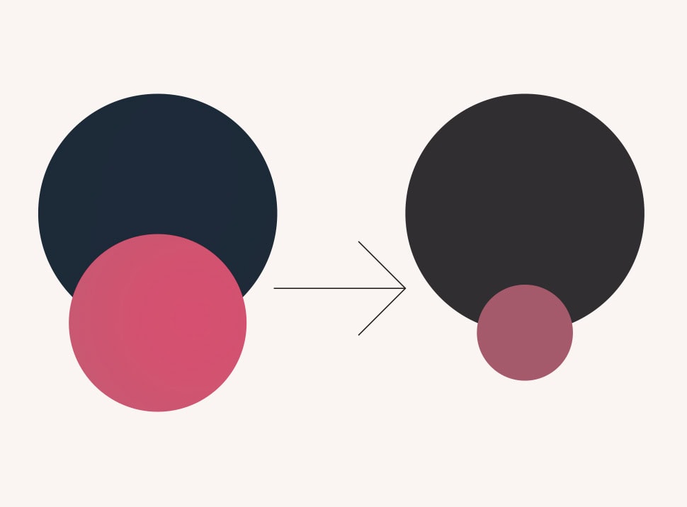
during the development of the new graphic format we have been guided by a tagcloud with three cornerstones: dynamic, organized and contemporary. on these semantic groundings we have built a visual system based on a series of rectangular shapes moving around in a responsive way so to adapt easily on different devices and tools.
we have reserved a particular interest to the art direction and the iconographic support of all the communication.
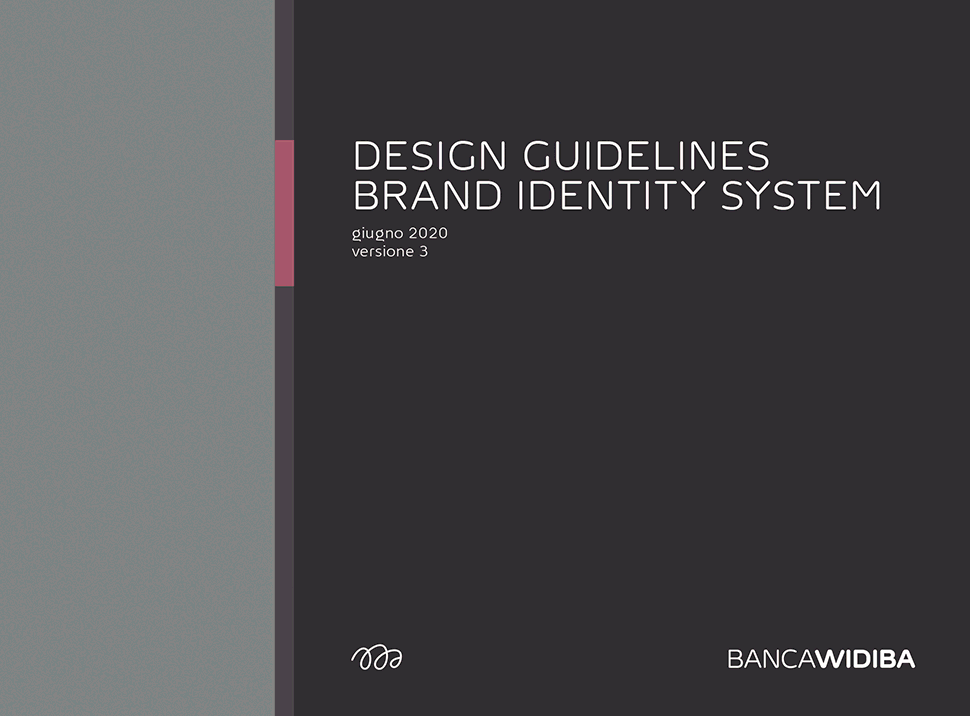
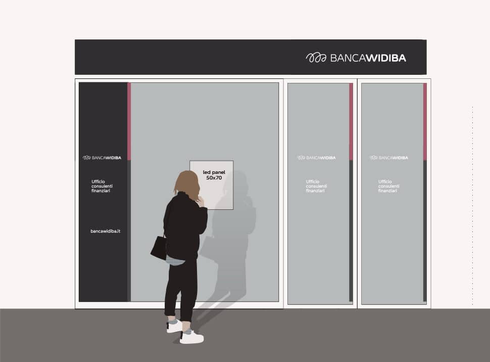
our work, comprehending the external restyle of the financial advisors offices throughout the territory, has been concluded by the realization of the brand manual and the video launching the new identity.
during these years of consultancies at widiba we had the chance to meet a lot of energy people with whom we share a innovative vision and who inspired us over time.
it feels like being real partners of this group we still give support to in the development of the brand identity.
services
art direction
branding
consultancy
editorial
environmental
graphic design
installation
naming
type design
visual identity
wayfinding
credits
type design with
fabrizio schiavi
calligraphers
luca barcellona (italy)
team blazin (holland)
barbara calzolari (italy)
francesco guerrera (italy)
mr kams (spain)
deep masito (italy)
piger (italy)
andrea rafiki (italy)
mr zé (spain)
alessandro zonta (italy)