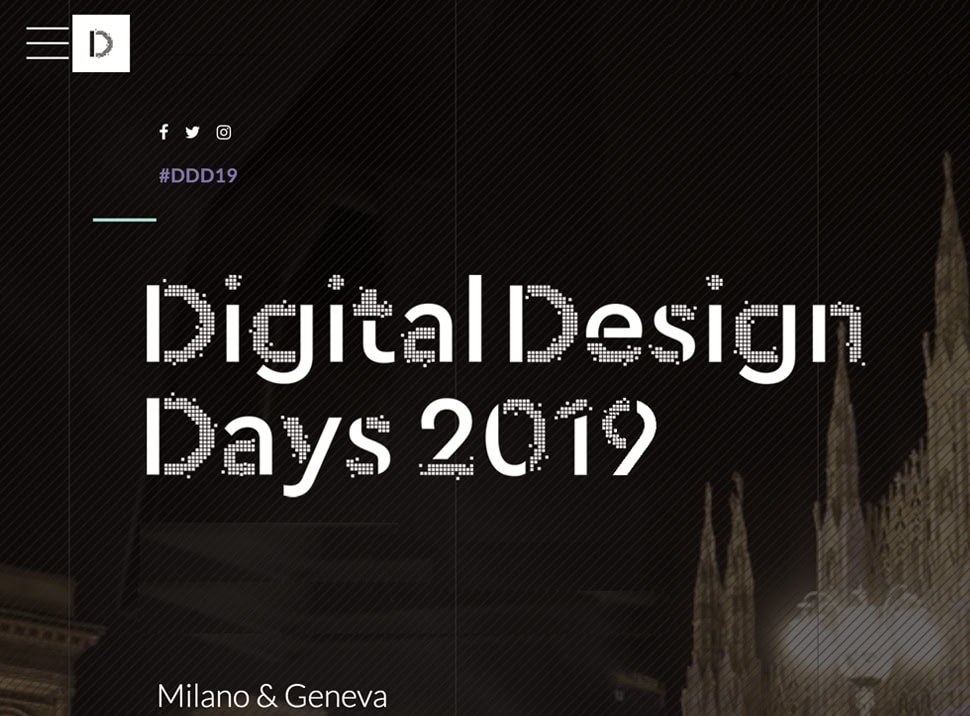
digital design days is the international event dedicated to digital design, it has been created by filippo spiezia in 2016.
The project is due to reinforce the founders’ willingness to be an international reference, confirming their ability to select, narrate, and reward the most visionary and most creative digital designers.
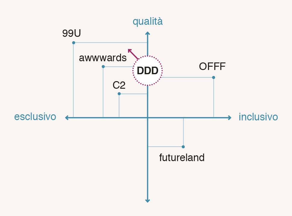
we’ve been involved in 2019 to design the new brand signature and we developed it with a wider viewing, underlining how this event is already felt like a real brand by being always able to guarantee the highest quality in what it proposes.
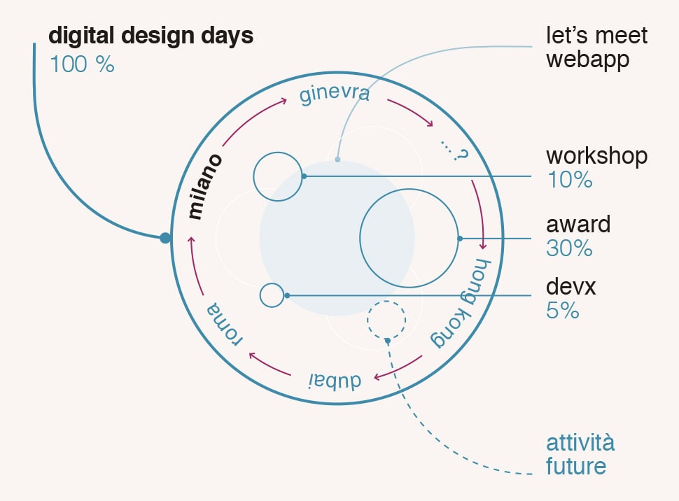
Since its first edition the festival has been able to create a network between all the participants, and this network succeeded in growing beyond the event itself. Professionals, entrepreneurs, and companies started to collaborate in order to make what they had in mind for the future come true, after participating to the event and sharing their ideas.

We have analyzed and defined the deepest side of DDD in order to create a really distinctive visual identity.
a brand has to be able to live and evolve. it has to work on different situations. it has to have the possibility to adapt, as a real human being, but still always remaining faithful to itself. that’s the way how to create a bond between the brand and its audience, a relationship based on trust and values sharing.
so, following our method, the first question to which find an answers has been: who is digital design days?
our working process is totally shared with the client through interviews, tests and moodboards we work to let emerge brand values and its personality defining the style and the tone of voice it will carry on.
we try to help the client, working between archetypes and neuroscience, to gain awareness of who is or of who want to become.
we started to design the outside, the shape, the appearance, only after developing the insides of the brand.
the new brand is the synthesis of a long visual and conceptual research.
it has been decided to design a new sign but still able to evoke the one of the previous editions thanks to the adding of a squared shape.
all the formal explorations we developed, looking for the necessary distinctiveness of the event, have been guided by the natural synthesis of digital design days spirit, values and activities.

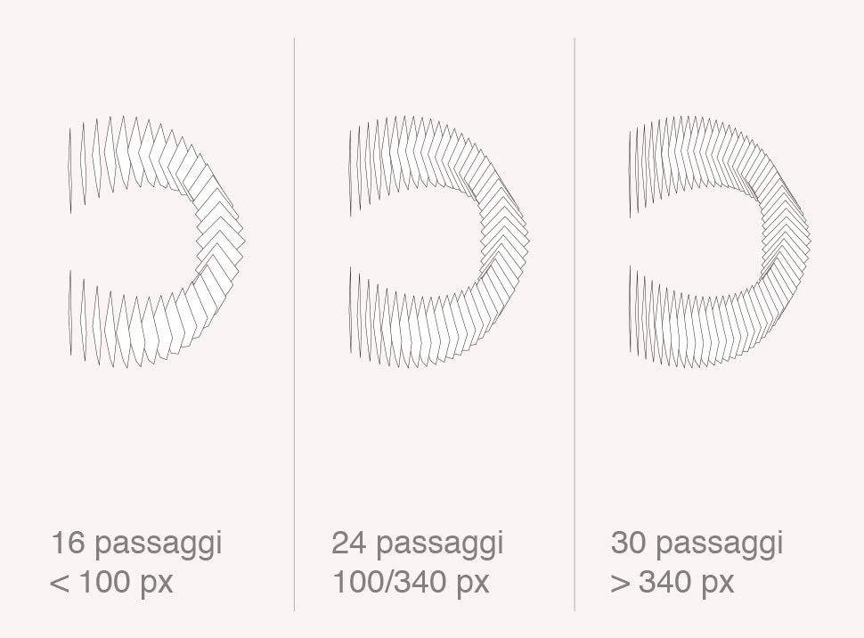
the D that has been chosen is light, energy, movement, different single elements that come together to define it, pixels overcoming their two-dimensional feature, squares that rotate and find a new place around the central focusing point.
it is a sign able to communicate the strength of DDD innovative vision and its capacity to create network and to attract, propose and unite people and different ideas.

we designed a responsive sign, able to adapt to the dimension of usage by just changing the frequency of the single elements of which it is made, resulting in obtaining a more efficient utilization in every different application.
a contemporary and innovative vision of the brand signature imagined as a alive and vital element.
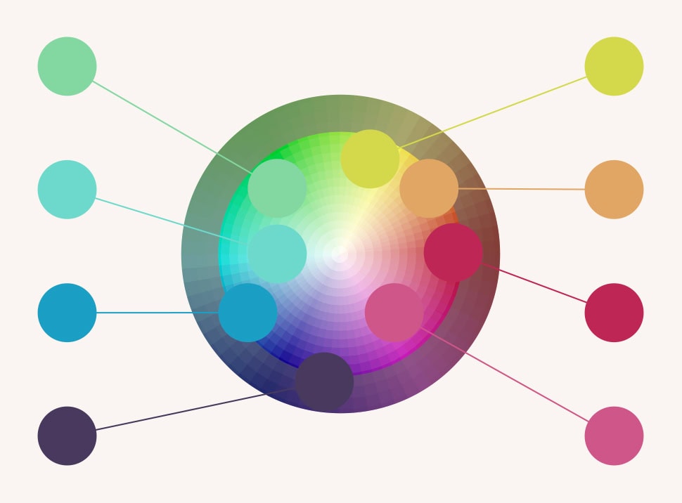
the main palette of the visual identity system is made of nine colors, contributing to define different editions in different countries.
the selected colors are rgb native tones, luminous and with high contrast. In the identity system each color fades into another thanks to easy geometrical shapes morphing creating a dynamic yet sophisticated impact, well suited for the communication of this event.
the analysis of this project has been particularly curated and we’ve reached a definition, together with filippo spiezia and his team, of the deepest characteristics of this event. starting from what the event was and imaging what should it become, the final sign is able to represent and let it be internationally recognizable.
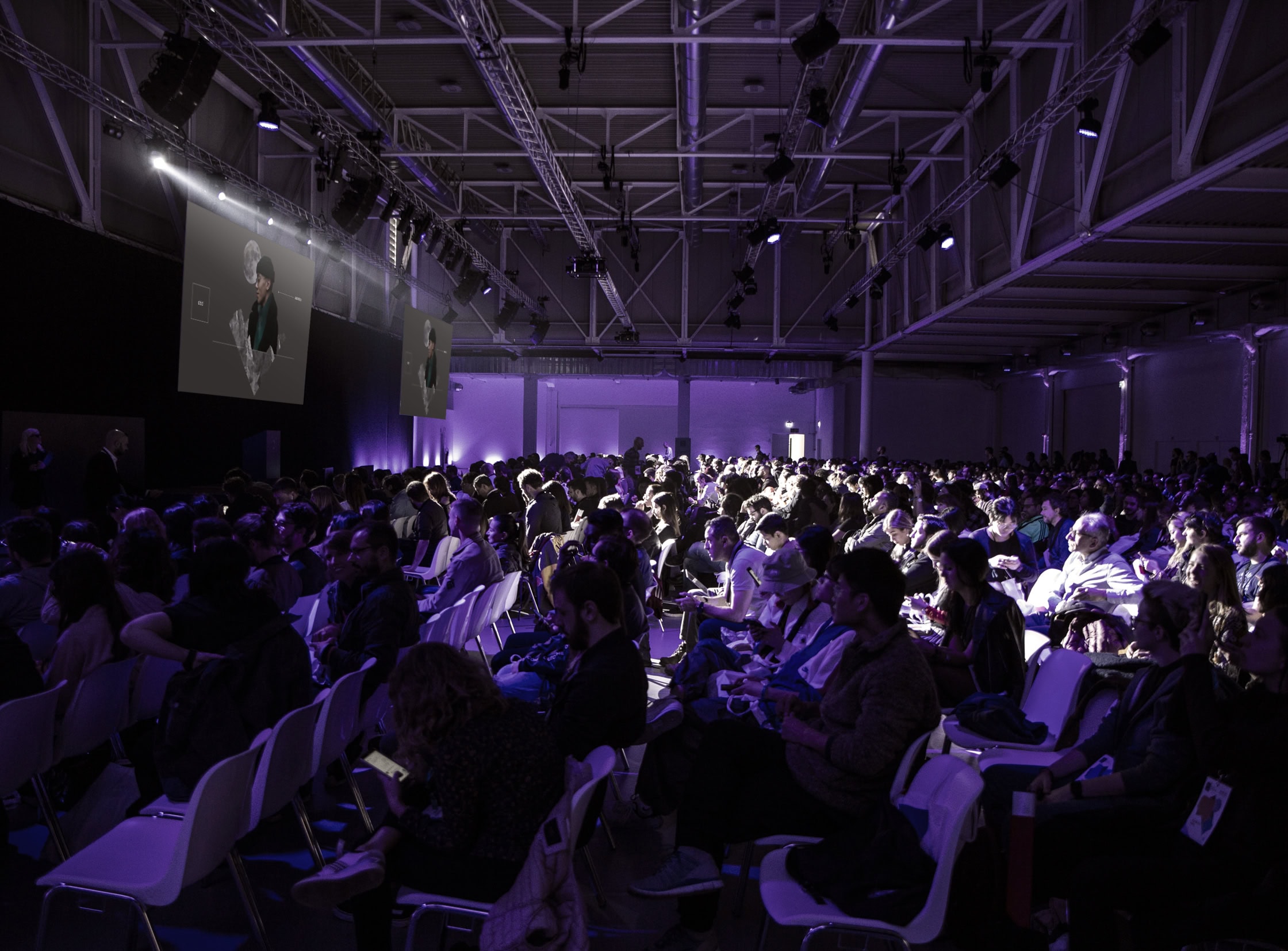
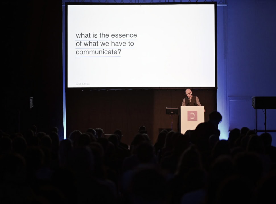
the special conclusion of this work occurred during the last festival edition, on october 2019, when, during the new brand launch, we had the occasion to share with the public our entire process of the rebranding project.
__
services
art direction
branding
consultancy
concept development
graphic design
strategy
visual identity
credits
logo animation
nerdo
logo sound
combustion studio